
Confirmation was ending the journey
For business travel, the expected sequence is flight, hotel, then cab. The existing confirmation page behaved like a receipt, even when the traveller still had most of the trip left to plan.
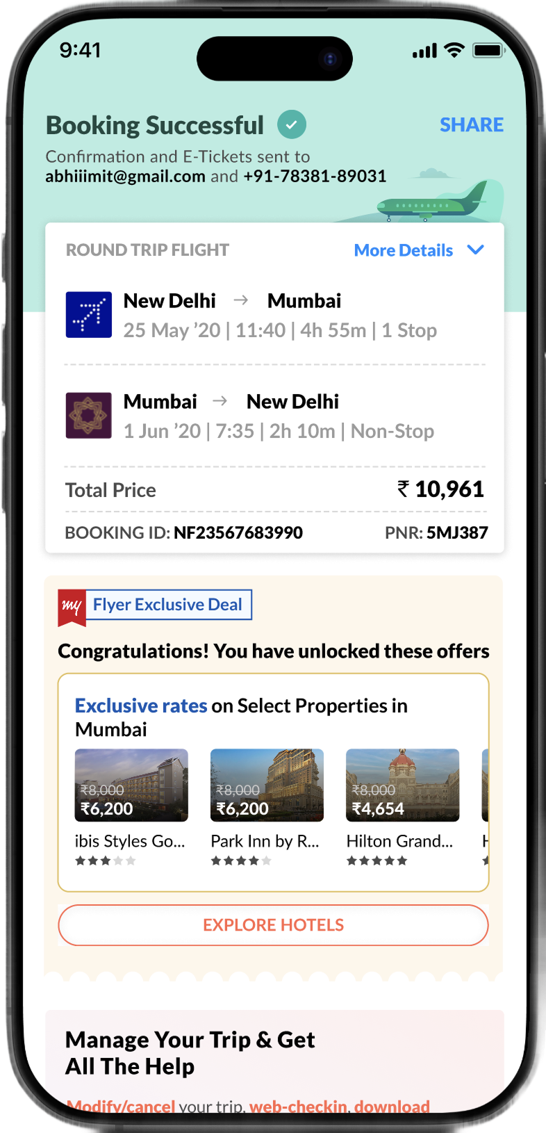
What the existing experience made difficult
- The page closed the flight task without bridging travellers to the next trip need
- Hotel discovery was visually buried below the primary confirmation content
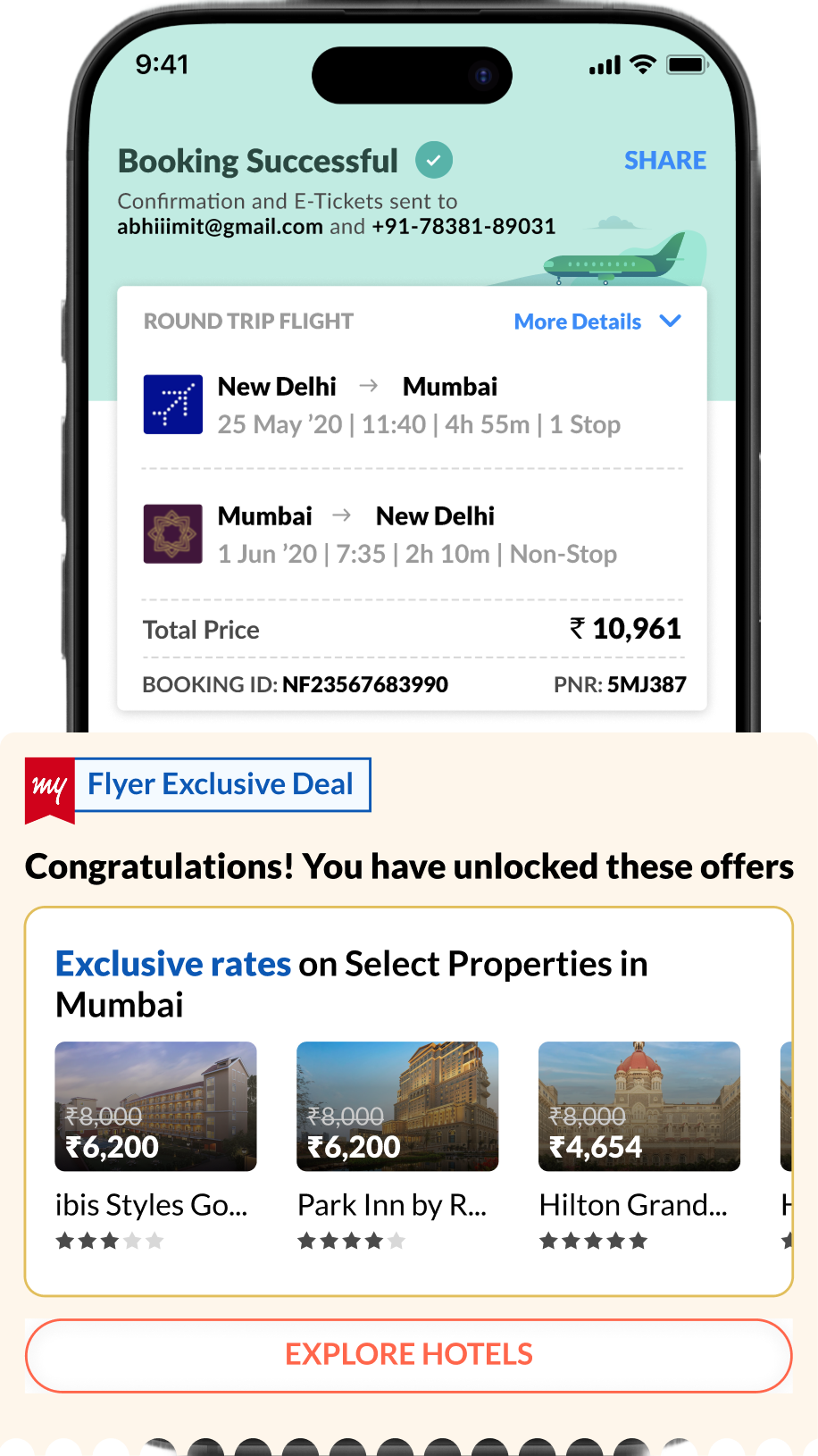
The hotel banner was present, but it did not guide the next decision
- It competed with confirmation instead of feeling integrated with the journey
- Generic properties and prices did not explain relevance or build confidence
Meanwhile employees asked their colleagues“Which hotel do you usually stay in?”
The question employees repeatedly asked before booking
Research showed that people did not need another large list.
They needed reassurance that the next recommendation fit their trip and their organisation.
The opportunity was to build more trust and personalise the hotel recommendations
Reassure before recommending
Keep booking success unmistakable before introducing the next task.
Reveal instead of interrupt
Use timing and hierarchy to make the recommendation feel contextual.
Curate one useful option
Reduce decision effort by leading with one relevant property rather than a feed.
Explain why it fits
Make personalisation visible so the recommendation earns trust.
Directions clarified the right level of intervention
Each concept tested a different balance between visibility, choice, and reassurance. The final direction won because it made the next step obvious without turning confirmation into another marketplace.
Hotel options in a draggable bottom sheet
This felt more forced than integrated because flight confirmation, which was primary to the user, took a back seat in this approach
Add-ons and hotels inside a carousel below the price breakup
It had discovery issues and was rejected because it diluted hotel visibility
Hotel, adtech, and cross-sell on the first fold
This became more relevant to B2C customers because flight information stayed intact, while hotels remained offer-driven with a generic call to view them
Flight information first, hotel cross-sell revealed with a delay
Confirmation stayed clear while one trusted hotel surfaced as the most useful next action
What the confirmation page had to account for
Before jumping into the redesign, the complete information hierarchy and every possible booking state had to be taken into account
Booking status
- Successful
- Fetching or pending
- Failed or unavailable
Traveller and booking
- Primary traveller
- Co-travellers
- PNR and booking ID
Flight cards
- Airline logo and name
- Source and destination cities
- Timings and dates
- Terminal information
- One-way, round trip, and multi-city
Price and actions
- Price breakup
- View booking in MyTrips
- Share booking
- Download ticket
Trip continuation
- Airport cabs
- Hotels
- Other services
The Booking Successful
The redesigned hierarchy keeps the completed booking readable, then transitions into a single hotel recommendation without losing the flight context.
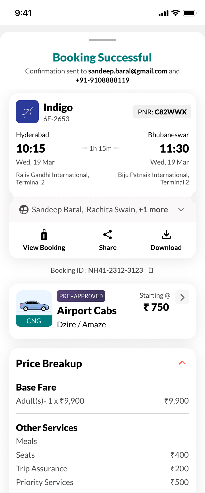
When the success moment is secure, the hotel recommendation can feel like help rather than an upsell.
Booking didn't go through seamlessly
Success was only one branch. Slow status checks, failed bookings, pending SME payments, and unavailable status responses needed equally clear recovery paths.
The existing design had a circular loader. We introduced a timer to communicate the booking status
The failure flow keeps the itinerary visible, explains what happened, and provides a recoverable next action. The motion study shows how fetching and failure states connect without leaving the traveller in doubt.
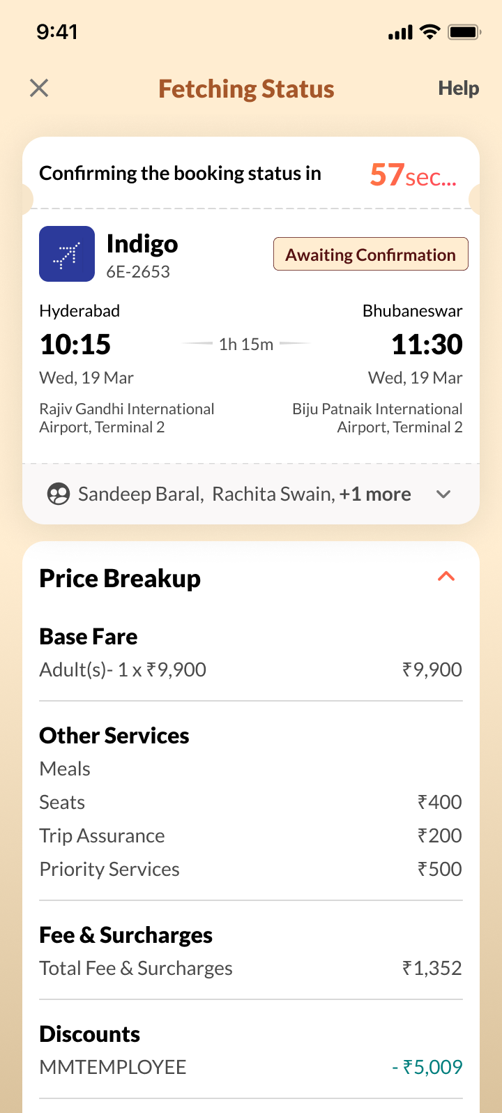
Fetching status
A time-bound status message sets expectations while the system verifies the booking.
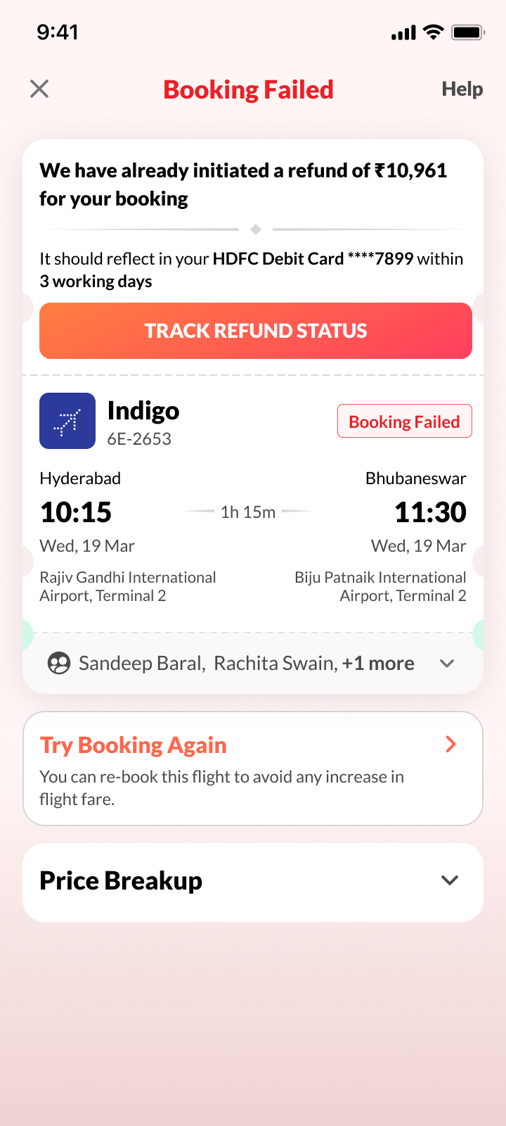
Booking failed
The refund state is explicit, the itinerary stays visible, and trying again remains within reach.
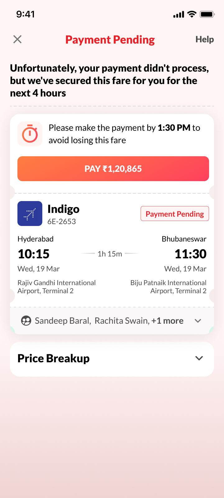
Payment pending for SMEs
When payment remains pending, the interface keeps the booking context visible and provides a clear, time-bound path to complete payment.
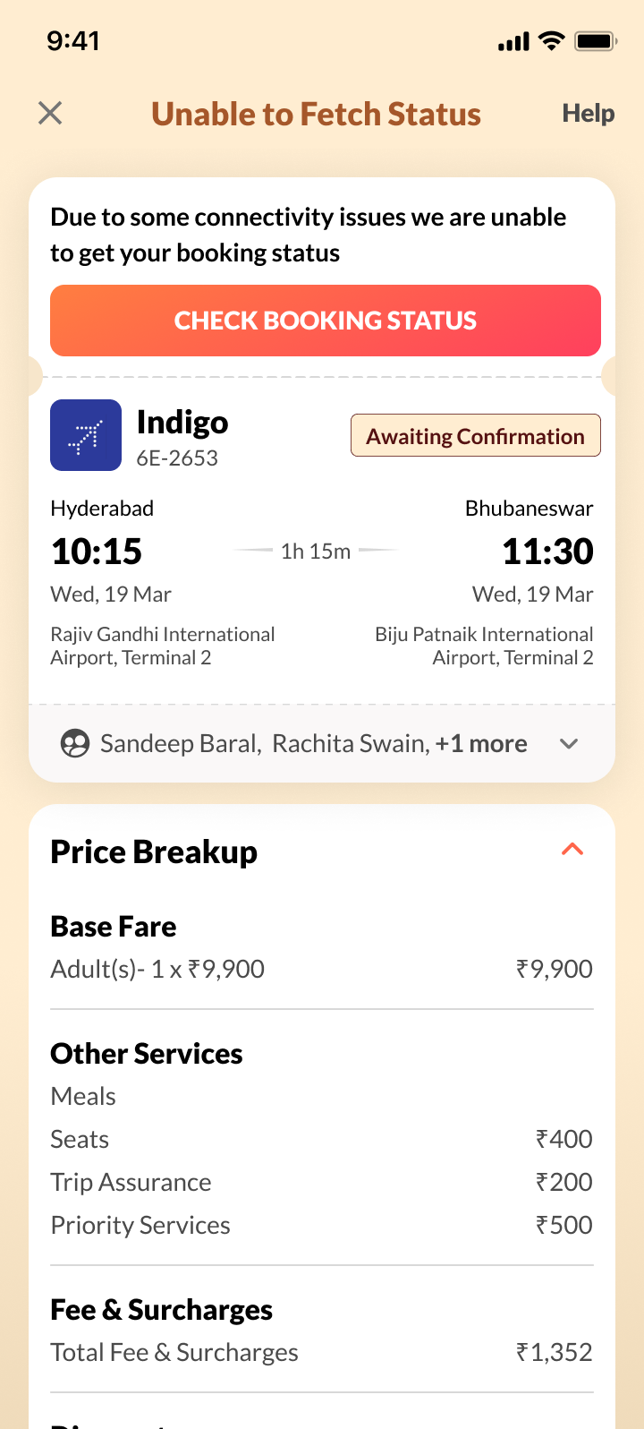
Status unavailable
The fallback explains what the system could not retrieve and offers a safe next action without implying failure.
New tags were introduced
More personalised signals created trust and gave travellers a persuasive reason to open the hotel details page. Each tag explains why the recommendation is relevant instead of asking the user to trust an unexplained ranking.




All New Confirmation Page
The completed confirmation flow uses contextual tags at the recommendation moment, so travellers understand why the hotel is being surfaced before they move into details.